Create different page layouts using columns, groups, spacers and separators. Combine these with many other blocks to get creative with pages and make visually distinctive layouts.

Column block
Use the columns block to display content in multiple columns across the page. You can build up content blocks within a column to create a layout.
When you add a column block you can choose if you want 1, 2 or 3 columns and how you want them arranged.

Once you’ve selected a column layout you can click the plus (+) ‘add block’ symbol to add content blocks to the column. You can keep adding blocks within the column if needed.
EXAMPLE
Column 1
This example uses the 3 columns, equal split layout (33 / 33 / 33).
Column 2
You can add other blocks into each column, like an image:

Column 3
Or any other block such as a list:
- list item 1
- list item 2
- list item 3
Find out more about the columns block on WordPress

Group block
Use a group to gather blocks together in a ‘container’. The group block allows you to group different blocks together and customise them, including setting background colours, spacing, and more.
Inside the group block, you can add a columns block, or any other available block to create the layout of your choice.
Example of a group block
EXAMPLE

A media and text block within the group. Having blocks within a group block allows you to change background colours and set it to full-width.
Column heading
Separator, heading, paragraph and buttons in a column turned into a group to allow customisation of colour and style of corners.
Column heading
Separator, heading, paragraph and buttons in a column turned into a group to allow customisation of colour and style of corners.
Find out more about the group block on WordPress

Separator
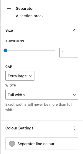
The separator block creates a break between 2 blocks of content with a horizontal line.
This helps to create a separation between sections on your page or within another layout block.
In the block settings on the right-hand panel, you can adjust the:
- thickness of the separator line
- gap before and after the line (medium, large or extra large)
- width across the page or section
- colour of the line

Examples of the separator block
EXAMPLE
Find out more about the separator block on WordPress

Spacer
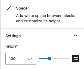
A spacer block is simply a way to add a blank space between blocks. It’s a good idea to add white space to improve the design of your page and help users find what they need.
You can adjust the height of the spacer block in the block settings on the righthand side in editor view.
Use spacers wherever you need them – in a page layout and nested within group blocks or columns.

You can also use the handle at the bottom of a spacer block and drag to adjust the height.
Find out more about the spacer block on WordPress
Combining blocks together
You can start to build up different layouts using combinations of these blocks and more. See the example below.
Extra large heading
Content blocks gathered together in a group can be arranged to sit in the centre, and you can add a different colour background.
The example above is a group block (customised to blue and full-width) with a spacer > 2 columns (then a group within each column) > spacer.
The nested groups in each column are set to a white background with the corners set to ‘slightly rounded’.
This is followed by another group block (customised to light grey and full-width) with a spacer > heading level 2 > paragraph > button > spacer.
You do not want to add too many of these customised blocks and colours on your page or it could be overwhelming, but they can add clear visual difference for important information or calls to action.